

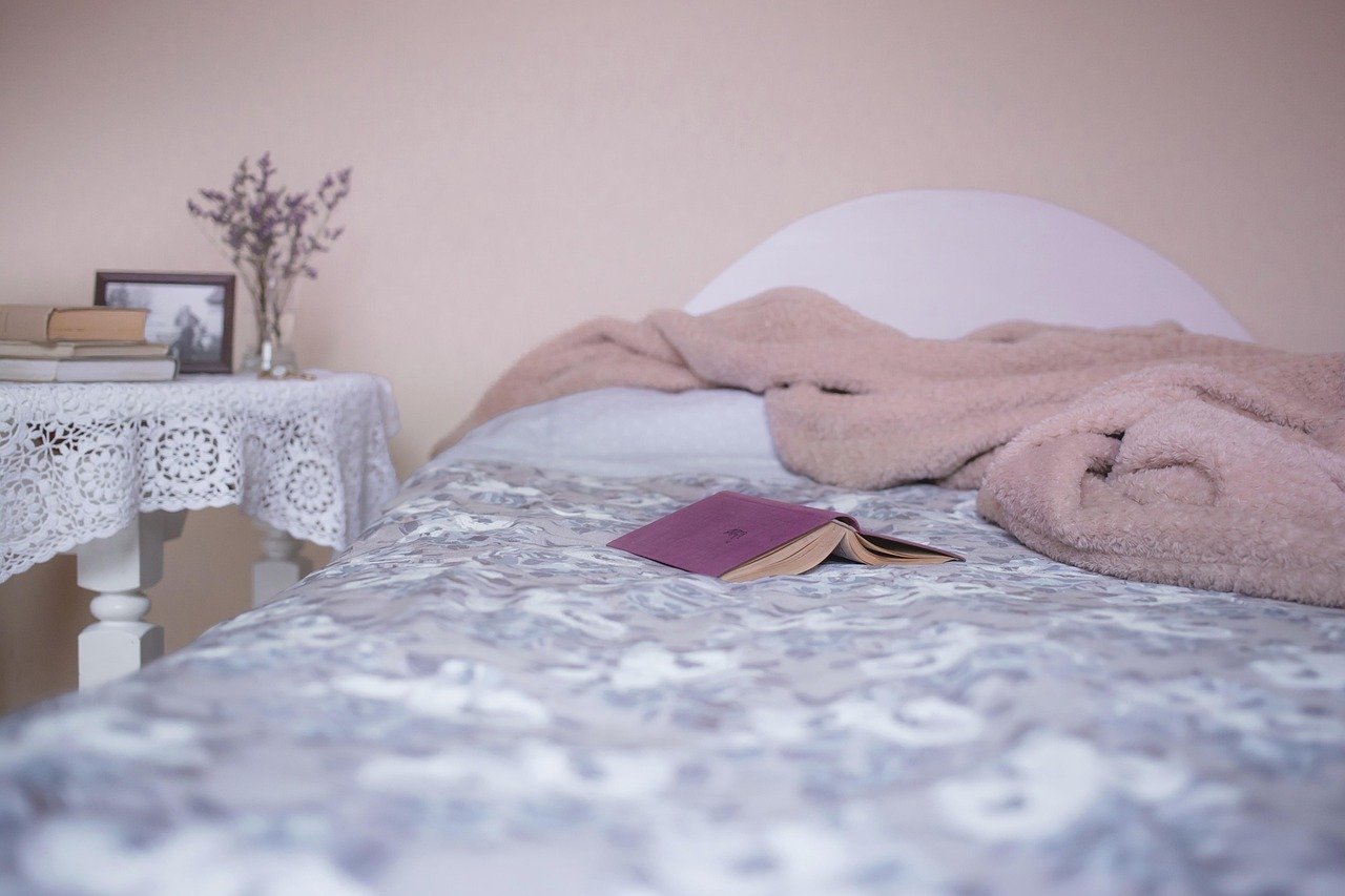
Fixed finishes set the color direction: identify their undertones, then select linens that suit your wall color, flooring, furniture, and bedroom lighting. Your duvet cover carries the largest flexible color field, so its shade can either settle the room or make nearby finishes look wrong.
You’ll work from permanent room features toward removable layers, using swatches, simple color relationships, and restrained accents before tags come off.
Fixed Room Colors Set the Bedding Direction
Your wall paint, carpet, wood furniture, rug, curtains, and metal finishes set the visual limits before bedding enters the room. A beige carpet with gold flecks asks for different linens than a gray carpet with blue fibers, even where both surfaces appear neutral from the doorway.
Permanent finishes deserve a written inventory
Walk through your bedroom in daylight and list surfaces likely to remain for at least a year. That short inventory keeps you from choosing a duvet cover that suits one wall but fights the floor, headboard, or window treatments.
- Wall paint: Record whether your walls read creamy, blue-gray, green-gray, tan, warm greige, or stark white.
- Flooring details: Check carpet fibers, hardwood stain, tile grout, and rug borders for yellow, blue, red, or green casts.
- Wood furniture: Honey oak, walnut, espresso, and weathered gray wood each shift the linen colors that feel settled.
- Window treatments: Include curtains, blinds, and shades because fabric and slats alter daylight near the bed.
- Upholstered pieces: Add the headboard, bench, chair, or storage ottoman sitting near your sleeping area.
- Metal finishes: Brass reads warm, while chrome and black iron add cooler contrast.
Separate those fixed elements from removable layers such as sheets, shams, throws, and accent pillows. Your bedding can soften a rental bedroom with builder-white paint, landlord-provided curtains, or beige carpet without requiring a repaint or flooring change.
Coordination creates more depth than exact matching
Matching bedding to wall color exactly can flatten the room into one broad field. Use related shades instead, such as pale olive beside beige carpet or dusty blue near blue-gray paint, so the bed keeps a clear outline.
A color wheel makes those relationships easier to spot. Analogous colors sit beside each other, such as blue and blue-green, while complementary colors sit opposite each other, such as muted terracotta and blue-gray.
Your room needs a small amount of contrast, not a color duel. A neutral color palette with one restrained opposing accent gives you more flexibility than four unrelated shades competing across the bed.
That flexibility only holds when the neutrals share an undertone under the light you actually use.
Undertones and Light Reveal Whether Neutrals Belong Together
The fixed-color inventory becomes useful once you identify the faint cast beneath each neutral. Ivory can carry yellow, pink, or gray; taupe can lean violet, green, or brown; and white wall paint can appear icy beside one fabric yet creamy beside another.
Warm and cool undertones need a shared direction
Warm colors carry yellow, peach, red, or golden influence. Cool colors carry blue, gray, violet, or silver influence. A warm ivory sheet set beside cool gray walls can look dingy, while blue-white linens can feel severe against honey oak and warm taupe paint.
| Room anchor | Undertone signal | Bedding directions that relate well |
|---|---|---|
| Cool gray wall paint | Blue or violet cast | Crisp white, misty blue, slate, muted lavender |
| Warm greige walls | Beige, tan, or brown cast | Flax, mushroom, clay, olive, warm ivory |
| Honey oak furniture | Golden-yellow cast | Oatmeal, sage, warm white, muted navy |
| Dark espresso furniture | Deep red-brown cast | Soft charcoal, flax, dusty blue, pale green |
Hold fabric against both the wall and a wood surface. A swatch that suits paint alone may still clash with your headboard, dresser, or nightstand.
Bedroom lighting changes the final color judgment
Morning daylight shows a fabric’s cleanest color, while warm bulbs pull cream, rust, and tan forward after sunset. Bedroom lighting also changes across the room, and a dark corner near a closet can make gray bedding appear several shades deeper than it looked near the window.
Bring a swatch home before removing tags. View it in morning light, under evening lamps, and beside the darkest wall; this three-place check exposes the blue cast in a so-called white sheet set before it covers your bed.
Base Bedding Colors Control Mood, Brightness, and Visual Weight
After undertones line up, your largest linen layer sets the room’s emotional weight. A duvet cover or comforter reads as the main field of color, while fitted sheets, top sheets, and fold-back edges appear in narrower bands.
Muted colors keep the sleeping area quieter
Soft blue, muted green, dusty violet, oatmeal, and gentle warm white suit a restful bedroom because their lower intensity asks less from your eye at night. Dusty eucalyptus sheets beneath a blue-gray duvet, for example, work well in a room meant to feel hushed after dark.
Rust, ochre, terracotta, and warm brown make the same room feel closer and more intimate. Choose these earth tones in bedrooms with ample daylight or pale walls, since their visual weight can make a dim space feel enclosed.
Light bedding reflects more available light
In a small or dark bedroom, pale linens reflect available light across the bed and help the space feel more open. Soft oatmeal, pale sage, warm white, and misty blue add depth without swallowing light in rooms with limited sun.
| Base color family | Visual effect | Practical use |
|---|---|---|
| White or ivory | Bright, clean, open | Flexible with changing pillows and throws |
| Oatmeal or taupe | Soft, grounded, warm | Works well beside wood and beige flooring |
| Soft gray | Quiet, tailored, cool | Fits blue-gray paint and black metal |
| Deep navy or charcoal | Dense, cocooning, dramatic | Disguises minor stains more easily |
White remains a widely chosen bedding color because it moves between decorating styles with little effort. Your cream duvet should echo warm walls and wood, while cool white belongs more naturally near blue-gray paint or chrome accents.
Layered Bedding Works Best With Two to Four Related Colors
A bed looks intentional once each layer has a separate visual job. Use a 60-30-10 split: about 60 percent dominant color, 30 percent supporting color, and 10 percent accent color.
The numbers describe visual area rather than exact measurements. Your eye should see one calm field, a related secondary layer, and a small accent rather than equal blocks of competing color.
Large layers should carry the quietest shade
Set the duvet cover or comforter as the dominant 60 percent. Sheets and shams can hold the supporting 30 percent, while a throw, lumbar pillow, or two accent pillows carry the remaining 10 percent.
- Choose the field: Put your calmest or most adaptable shade on the duvet cover because it covers the greatest area.
- Set sheet contrast: Use lighter sheets to brighten dark bedding or darker sheets to ground pale bedding.
- Repeat one cue: Echo a small shade from curtains, rug trim, or artwork in one sham or throw.
- Limit accent colors: Keep accent pillows to one or two colors so the bed avoids a patchwork look.
Pattern needs a plain companion
Pattern scale controls visual noise across the bed. A large botanical duvet works with solid sheets, while a narrow stripe or small check sits comfortably beside a plain comforter.
Your pillowcases do not need another bold print. One patterned layer plus solid shams and a plain throw gives the pattern room to read from the doorway.
Sheets may be lighter or darker than a comforter; undertones and contrast matter more than a fixed rule. Pale sheets beneath charcoal bedding make the fold-back edge visible, while charcoal sheets beneath ivory bedding add grounding where both fabrics share the same temperature.
Those pairings shift when room size, light, and existing finishes limit how much contrast the bed can carry.
Room Constraints Call for Specific Color Plans
The layer formula becomes clearer in bedrooms with awkward finishes. Gray walls are not a complete instruction because blue-gray paint and warm greige may sit only a few shades apart while calling for entirely different linens.
Gray walls need undertone-aware pairings
Cool gray walls pair well with crisp white, blue-gray, slate, and quiet navy. Warm greige walls suit mushroom, flax, muted clay, olive, and cream, and your eye reads these pairings as connected without seeing an exact match.
A bedroom painted Sherwin-Williams Agreeable Gray, a warm greige, can carry flax sheets, a mushroom duvet, and a muted clay throw. A room painted in a cooler Benjamin Moore gray can carry white sheets, a dusty blue comforter, and one charcoal lumbar pillow.
Low-light rooms benefit from tonal brightness
Covering every surface in white can make a dim bedroom feel flat rather than brighter. Use tonal layers instead: warm white sheets, a pale sage duvet, and a light oatmeal throw create separation while preserving reflected light.
Your strongest contrast belongs in a small dose, such as one dark pillow or a narrow charcoal throw. That restraint stops the bed from becoming the visual wall at the center of a compact room.
Rental bedrooms respond well to adaptable neutrals
Beige carpet pairs well with ivory and olive, while builder-white walls can hold navy and camel without looking cold. Dark furniture softens beside flax, sage, and soft charcoal, especially where your rug carries a small thread of one of those shades.
Seasonal textiles shift the mood without requiring a full linen change. Trade a rust throw for faded blue in summer, or change two pillow covers while neutral bedding remains the stable layer beneath both looks.
Swatches and Removable Layers Reduce Expensive Mismatches
Fabric photographs flatten texture and distort color, particularly beneath studio lamps. Start with the largest removable layer, such as a duvet cover, rather than changing sheets, quilt, blanket, shams, and pillows at the same time.
Swatches show real-room color shifts
Order swatches where they are available and inspect return terms before bringing home a strong shade. A reversible duvet cover gives your room two related directions, such as flax on one side and muted olive on the other, without filling a closet with unused linens.
Skip highly saturated red, neon shades, and sharp black-and-white pairings where rest is the goal. Their contrast remains visually active under bedside lamps even after surrounding details fade into darkness.
Neutral anchors keep trend colors removable
Neutral bedding leaves room for color changes because throws and accent pillows carry trends at a smaller commitment. Your long-term anchor can be oatmeal sheets, ivory linen, soft gray percale, or a versatile taupe duvet cover.
Finish with a full-room view from the doorway after dark. Your wall color, furniture, floor, and bed should feel linked under actual lighting rather than only beneath bright store fixtures.
Final Thoughts
Strong bedding choices begin with what cannot move, then use undertones and light to narrow your options. Your final palette needs two to four related colors, one quiet dominant layer, and a small accent that can change through the year.
That room-first approach keeps you from chasing an isolated fabric shade that falls apart once it reaches your bedroom. Start with your walls and floor, check swatches near wood furniture, then layer color from the duvet cover outward.
FAQ
How do I choose bedding colors that go with my bedroom walls?
Start with the undertone in your wall color, then choose bedding with a similar warm or cool direction. Your duvet and sheets do not need an identical shade; flax works well with warm greige, while misty blue and crisp white work well with blue-gray walls.
Should bedding match the walls exactly?
A near-match or deliberate contrast usually works better than an exact wall-and-bedding color match. Your duvet and sheets should share a compatible undertone or color relationship with wall paint, then add enough contrast for the bed to stand apart. A warm greige wall looks more layered with flax bedding than with an identical greige comforter.
Should sheets be lighter or darker than a comforter?
Against a dark comforter, lighter sheets brighten the fold-back edge, while darker sheets give a pale comforter visual weight. Your choice works best where both layers share warm or cool undertones. Contrast matters more than following a light-over-dark rule.
What bedding colors make a small bedroom feel larger and brighter?
Warm white, oatmeal, pale sage, and misty blue reflect more available light than deep navy or charcoal. Your small bedroom still needs contrast, but limit the darkest shade to one pillow, a narrow throw, or a small trim detail.
What color bedding suits a relaxing bedroom?
Muted blue, soft green, dusty violet, oatmeal, and gentle warm white suit a restful room. Your bedroom lighting changes the result, so view the fabric after sunset and during daylight. Lower-intensity colors feel calmer than neon shades or hard black-and-white contrast.
What colors are not ideal for a bedroom?
Highly saturated red, neon yellow, neon green, and intense black-and-white combinations can feel visually active near bedtime. Your room can still hold those colors in a small artwork detail or removable pillow cover. Keep the largest bedding layer quieter where rest is the goal.